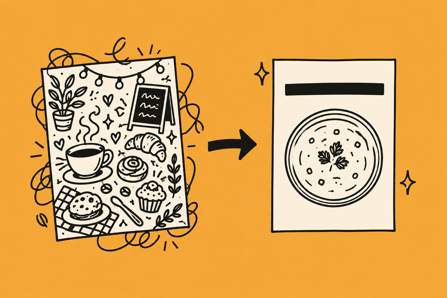
You know the image. A café interior with too many chairs, plants in every corner, three pastries, a chalkboard with wobbly text and a warm glow over everything. It’s fine. It’s also the same image every other café posted this week.
That’s AI image slop, and it nearly always comes from one thing: one prompt, first result, posted.
AI is quick at making graphics, but quick only arrives after a bit of work at the start. Deciding what the image is for, learning what to leave out, getting used to a second and third round. That’s a short learning curve once. After it, every image takes minutes. Skip it and you start from scratch, and get slop, every time.
The process is the same whether you’re the owner posting on a Sunday night, a social media manager running six accounts, or a marketer producing a month of visuals in a week. The examples run through a hypothetical café. Swap in your own business or your client’s.
The three ways AI images fail
- Too much small detail. Lovely at full size on a laptop. On a phone, at the size of a stamp, it’s noise.
- Not scannable. No single thing your eye lands on first. A good image has one subject, one message and space around them. Slop has six subjects and no space.
- Too generic. It looks like every business in the category. Nothing in it belongs to you.
Every step below fixes at least one of these.
Step 1: Decide what the image has to do
Start with the job, not the tool. One sentence each:
- Where will it live? A feed at thumb size, a window poster read from three metres, a carousel. Each needs less detail than you think.
- Who’s looking? A lunchtime crowd needs big, warm and obvious. A design studio’s LinkedIn audience can take small and sparse.
- What’s the one thing? A bowl of soup. A cup. A hand holding a loyalty card. Not the whole café.
- Where does the text go? Top third, bottom third, or left half. Decide now so the image leaves room.
Café soup poster: window, passing lunchtime trade, one bowl of soup, text top third. That’s the brief.
Not sure what style suits the business? Ask before you generate anything. Paste this into ChatGPT or Claude and fill in the brackets:
“I run [type of business] in [town]. Our customers are mostly [who, when, what they care about]. The business feels [three words]. I need images mainly for [Instagram / Facebook / window posters / LinkedIn]. Suggest three base visual styles that suit this business and audience: composition, colours, amount of detail, photo or illustration, how text sits. Say which you’d pick and why. Then list two popular styles I should avoid and why.”
For a family café it’ll suggest bright natural photos, one big subject, warm colours, room for a bold headline, and tell you to avoid the dark moody restaurant look because it reads as expensive. Pick one and stick to it. A style that looks impressive is not the same as a style that works on your customers.
Marketers, run this with every new client in week one. It turns “I love this” from the owner into a conversation about what their customers respond to.
Step 2: Write the prompt like a brief
“A cosy café image for Instagram” is a wish. The AI grants it with everything it knows about cosy cafés, which is the clutter you’re trying to avoid.
A working prompt covers six things:
- Subject. One. “A single bowl of squash soup with a bread roll beside it.”
- Composition. “From directly above, bowl in the lower two thirds, top third empty.”
- Background. “Plain, pale grey, no other objects.”
- Style. “Natural daylight photo, not illustration, not glossy.”
- Colour. “Warm orange and cream, nothing else.”
- What to leave out. “No people, no extra dishes, no steam, no chalkboards.”
That last line does more work than the other five. AI fills space unless you tell it not to.
Get the AI to interview you first. Most of the detail that makes an image yours is in your head and you’d never think to type it. So before it writes the prompt, add:
“Before you write the image prompt, ask me five questions about this post: what it’s for, who I want to notice it, what the one thing is, what it should feel like, and what it must not include. Wait for my answers, then write the prompt.”
Answer in rough lines. It’ll ask whether the soup is in a bowl or a cup, whether the poster is for the window or the counter, whether regulars respond better to “back by demand” or “new this week.” Those answers are what keep the image from being generic.
Step 3: Generate in rounds, not once
The first output is a draft. Treat it like one.
Round one. Generate four. Judge them against the brief, not for beauty. One subject, space where you said, nothing extra. Pick the closest.
Round two. Say what to fix, specifically. “Keep this image, remove the second bowl, plainer background, more space at the top.” Removing is nearly always the right instruction. Adding is how you got slop.
Round three. Small adjustments. Warmer, closer, more space. Stop when it passes the checklist in Step 5.
Three rounds takes about five minutes.
When you get one you like, save the recipe. Upload it back to ChatGPT or Claude and ask it to describe the style as a prompt: composition, lighting, colours, background, detail, where the space is. Save that paragraph with a name like “clean top-down product style.” Next time, open with “Use this style:” and add your subject. Three or four saved styles per business is plenty, and it’s how a feed starts looking like one business instead of ten prompts.
Marketers: rounds per image, not per month. “Give me 20 café images” is the one-prompt problem in a bigger coat.
Step 4: Get the words right, then put them in the prompt
Image generators handle text well now, so the words go in with the image. Adding text afterwards usually means there’s no room, or you cover the bit that was working.
- One message. “Soup and a roll, Tuesdays, €6” is a poster. “New menu, new hours, loyalty card, we’re hiring” is a notice board.
- Get the hierarchy written. Ask for a headline under six words, one supporting line under fifteen, details in as few words as possible. Pick from three headline options.
- Quote the exact wording in the prompt and say where and how big. “Headline ‘Tuesday is Soup Day’ in large bold text across the top third, cream on orange. Below, smaller: ‘€6 soup and a roll, 12 to 2pm’.” If you don’t quote it, the generator paraphrases.
- Keep it short. Less text means fewer errors and more readers. If it needs a paragraph, it’s a caption.
- Read every letter against what you wrote. A dropped letter or a made-up price still looks fine at a glance.
- If a word is wrong, regenerate. “Keep everything the same, fix the spelling of [word].”
Step 5: The pre-publish checklist
Two minutes, every image.
Scanning
- Shrink it to feed size. Can you tell what it is in one second?
- For a poster, print it or view it small. Can you read the headline from across the room?
- Is there one obvious place your eye lands first?
Clutter
- Count the objects. More than three is a warning sign.
- Is there empty space, or is every corner filled?
Generic
- Could the café next door post this exact image? If yes, add something that’s yours.
- Does it match the style you picked in Step 1, or has it drifted to the default look?
- Any AI giveaways? The glow, wobbly background text, extra fingers, floating objects, steam on everything.
Text
- Every word read letter by letter against the brief.
- Prices, days, times, names checked. Then checked again.
- Any words the generator added that you didn’t ask for? Regenerate without them.
Fit
- Right size and shape for where it’s going, cropped on purpose.
- Does it look like the last three things you posted?
Anything that fails, fix or bin. Never post a “close enough.”
Optional: keep a swipe file
You don’t need this. The five steps will get you there. But if you make images every week, or for several clients, a swipe file makes it faster.
It’s a folder of images you like with a one-line note on why. “Single object, huge, plain background.” “Text takes the top third.” Posts that stopped your scroll, a few of your own that worked, and two or three you hate so you can show the AI what to avoid. To use one, upload it and ask the AI to describe the style as a prompt, not the subject. Save that next to the image, same as the recipe in Step 3.
Only save images that fit your base style. Pretty isn’t the test. “Would my customers recognise this as us and be able to read it” is the test.
It gets quicker from here
The first few images take the longest. That’s the setup, and it’s a one-off. Once you have three or four good outputs saved with their recipes and a base style written down, the next image is: paste the style, name the subject, one quick round, check the text, tick the checklist. Ten minutes becomes three.
Then turn it into a skill. Save the style recipes, the interview questions, the text rules and the checklist as standing instructions. In Claude that’s a project or a skill. In ChatGPT it’s a project or a custom GPT. Next time you type “soup poster for the window, starts Tuesday” and it asks the questions, writes the prompt and reminds you what to check. The whole process in one message. Marketers, one per client. Handing over an account becomes handing over a link.
Or start with ours. We’ve built the whole process above into a ready-made Claude skill, the AIVA Image Brief. It checks for a saved style, runs the five questions, writes the prompt, gives you the round-two instructions, handles the text and runs the checklist on your finished image. Add it to Claude and your first image follows the process from the start. It’s free, and it’s the fastest way to see what the setup feels like before you build your own. Get it here. To install it, go to claude.ai, open Settings, then Capabilities, upload the zip under Skills, and it’s ready to use.
A note on real photos
Sometimes the best AI image is no AI image. A phone photo of the actual soup on the actual counter beats a generated one for trust, especially food, faces and anything a customer would recognise. AI images earn their place for what you can’t easily photograph: a concept, a seasonal mood, a consistent look across a month. Use both. Marketers, ask every client for a folder of real photos before you generate anything.
Before and after
Before. One prompt: “cosy café poster for autumn soup.” Result: full interior, four tables, two customers, garbled chalkboard, pumpkins, fairy lights, steam, orange glow. Posted as is. In the feed it’s a brown blur.
After. Brief: window poster, lunchtime crowd, one bowl of soup, text top third. Prompt with one subject, plain background, list of exclusions. Three rounds. Result: one bowl from above, pale background, “Tuesday is Soup Day” bold across the top, price and times small at the bottom, every letter checked. Readable at a glance in the feed. Readable from the road in the window.
Ten minutes more. The only one anyone looks at.
Across a team
One person doing this well is useful. A team doing it the same way is where the time comes back. The base style is written down, the prompt structure is shared, the rounds and checklist are the habit. The images stop depending on who was on the rota that morning.
That’s what our Team Training & Workshops are built for. We set up the styles, prompts and review steps with your team, run them on your real content, and leave you with a system that produces images that look like your business, not the AI’s idea of your industry. If you want to see what it would look like for your business or your agency, get in touch at aiva.ie. And if you’d rather try it yourself first, download the AIVA Image Brief skill and run your next poster through it.
The AI didn’t make it generic. The first output did, and you kept it.